Practical Single-Cell RNA-seq Visualization with ggplot2
Tommy Tang
2025-10-08
Last updated: 2025-12-23
Checks: 6 1
Knit directory: data_visualization_in_R/
This reproducible R Markdown analysis was created with workflowr (version 1.7.1). The Checks tab describes the reproducibility checks that were applied when the results were created. The Past versions tab lists the development history.
The R Markdown file has unstaged changes. To know which version of
the R Markdown file created these results, you’ll want to first commit
it to the Git repo. If you’re still working on the analysis, you can
ignore this warning. When you’re finished, you can run
wflow_publish to commit the R Markdown file and build the
HTML.
Great job! The global environment was empty. Objects defined in the global environment can affect the analysis in your R Markdown file in unknown ways. For reproduciblity it’s best to always run the code in an empty environment.
The command set.seed(20251007) was run prior to running
the code in the R Markdown file. Setting a seed ensures that any results
that rely on randomness, e.g. subsampling or permutations, are
reproducible.
Great job! Recording the operating system, R version, and package versions is critical for reproducibility.
Nice! There were no cached chunks for this analysis, so you can be confident that you successfully produced the results during this run.
Great job! Using relative paths to the files within your workflowr project makes it easier to run your code on other machines.
Great! You are using Git for version control. Tracking code development and connecting the code version to the results is critical for reproducibility.
The results in this page were generated with repository version bf3d061. See the Past versions tab to see a history of the changes made to the R Markdown and HTML files.
Note that you need to be careful to ensure that all relevant files for
the analysis have been committed to Git prior to generating the results
(you can use wflow_publish or
wflow_git_commit). workflowr only checks the R Markdown
file, but you know if there are other scripts or data files that it
depends on. Below is the status of the Git repository when the results
were generated:
Ignored files:
    Ignored:    .DS_Store
    Ignored:    .Rhistory
    Ignored:    .Rproj.user/
    Ignored:    .claude/

Unstaged changes:
    Modified:   analysis/01_intro_data_viz.Rmd
    Modified:   analysis/02_intro_to_ggplot2.Rmd
    Modified:   analysis/03_heatmap_demystified.Rmd
    Modified:   analysis/04_practical_scRNAseq_viz.Rmd
    Modified:   analysis/_site.yml
    Modified:   analysis/about.Rmd
    Modified:   analysis/index.Rmd
Note that any generated files, e.g. HTML, png, CSS, etc., are not included in this status report because it is ok for generated content to have uncommitted changes.
These are the previous versions of the repository in which changes were
made to the R Markdown
(analysis/04_practical_scRNAseq_viz.Rmd) and HTML
(docs/04_practical_scRNAseq_viz.html) files. If you’ve
configured a remote Git repository (see ?wflow_git_remote),
click on the hyperlinks in the table below to view the files as they
were in that past version.
| File | Version | Author | Date | Message |
|---|---|---|---|---|
| Rmd | bf3d061 | crazyhottommy | 2025-11-02 | update lesson 4 |
| html | bf3d061 | crazyhottommy | 2025-11-02 | update lesson 4 |
| Rmd | 8c9b351 | crazyhottommy | 2025-11-02 | first commit |
| html | 8c9b351 | crazyhottommy | 2025-11-02 | first commit |
Introduction
Single-cell RNA-seq analysis packages like Seurat provide convenient wrapper functions for creating visualizations. While these wrappers are quick and easy to use, they can be limiting when you need to customize plots for publications or create novel visualizations.
The key insight: All Seurat wrapper functions are ultimately accessing data stored in the Seurat object and passing it to plotting functions. Once you understand how to extract this data into tidy dataframes, you can use ggplot2 to create any visualization you want with complete control.
In this tutorial, we’ll:
- Analyze the classic PBMC 3k dataset following the Seurat tutorial
- Compare Seurat’s wrapper functions with custom ggplot2 implementations
- Show you how to access the underlying data from Seurat objects
- Demonstrate the flexibility you gain with ggplot2
Learning objectives:
- Understand where different data types are stored in Seurat objects
- Extract metadata, expression data, and dimensional reductions into dataframes
- Recreate common scRNA-seq plots using ggplot2
- Gain the flexibility to create custom visualizations
Setup
knitr::opts_chunk$set(echo = TRUE, warning = FALSE, message = FALSE,
                      fig.width = 10, fig.height = 5)

# Load required packages
library(Seurat)
library(SeuratData)
library(ggplot2)
library(dplyr)
library(tidyr)
library(patchwork)  # For combining plots side-by-side

# Set a theme for consistent ggplot2 styling
theme_set(theme_bw(base_size = 12))
Load the PBMC 3k Dataset
The pbmc3k dataset contains 2,700 Peripheral Blood Mononuclear Cells (PBMCs) sequenced on the Illumina NextSeq 500. This is a widely-used example dataset for learning scRNA-seq analysis.
# Install the dataset if needed (uncomment the next line on first run)
# InstallData("pbmc3k")

# Load the dataset
data("pbmc3k")

# The object comes pre-loaded but let's look at it
#pbmc3k

pbmc3k<- UpdateSeuratObject(pbmc3k)
Understanding the Seurat object structure:
pbmc3k@assays- Contains expression matrices (counts, normalized data, scaled data)pbmc3k@meta.data- Cell-level metadata (QC metrics, cluster assignments, etc.)pbmc3k@reductions- Dimensional reductions (PCA, UMAP, etc.)
Quality Control Metrics
First, let’s calculate QC metrics. We’ll compute the percentage of mitochondrial genes per cell, which is a common QC metric.
# Calculate percentage of mitochondrial genes
pbmc3k[["percent.mt"]] <- PercentageFeatureSet(pbmc3k, pattern = "^MT-")

# View the metadata where QC metrics are stored
head(pbmc3k@meta.data)
#> orig.ident nCount_RNA nFeature_RNA seurat_annotations percent.mt
#> AAACATACAACCAC pbmc3k 2419 779 Memory CD4 T 3.0177759
#> AAACATTGAGCTAC pbmc3k 4903 1352 B 3.7935958
#> AAACATTGATCAGC pbmc3k 3147 1129 Memory CD4 T 0.8897363
#> AAACCGTGCTTCCG pbmc3k 2639 960 CD14+ Mono 1.7430845
#> AAACCGTGTATGCG pbmc3k 980 521 NK 1.2244898
#> AAACGCACTGGTAC pbmc3k 2163 781 Memory CD4 T 1.6643551Visualization 1: QC Violin Plots
Let’s compare Seurat’s VlnPlot() with a custom ggplot2
version.
# SEURAT WRAPPER VERSION
p1 <- VlnPlot(pbmc3k, features = c("nCount_RNA", "nFeature_RNA", "percent.mt"),
              ncol = 3, pt.size = 0.1)

# GGPLOT2 VERSION - Extracting data from Seurat object
# Key concept: Metadata is stored in pbmc3k@meta.data
qc_data <- pbmc3k@meta.data %>%
  select(nCount_RNA, nFeature_RNA, percent.mt) %>%
  mutate(cell_id = rownames(.)) %>%
  # Convert to long format for ggplot2
  pivot_longer(cols = c(nCount_RNA, nFeature_RNA, percent.mt),
               names_to = "metric",
               values_to = "value")

qc_data_wide<- pbmc3k@meta.data %>%
  select(nCount_RNA, nFeature_RNA, percent.mt) %>%
  mutate(cell_id = rownames(.))


head(qc_data_wide)
#> nCount_RNA nFeature_RNA percent.mt cell_id
#> AAACATACAACCAC 2419 779 3.0177759 AAACATACAACCAC
#> AAACATTGAGCTAC 4903 1352 3.7935958 AAACATTGAGCTAC
#> AAACATTGATCAGC 3147 1129 0.8897363 AAACATTGATCAGC
#> AAACCGTGCTTCCG 2639 960 1.7430845 AAACCGTGCTTCCG
#> AAACCGTGTATGCG 980 521 1.2244898 AAACCGTGTATGCG
#> AAACGCACTGGTAC 2163 781 1.6643551 AAACGCACTGGTAChead(qc_data)#> # A tibble: 6 × 3
#> cell_id metric value
#> <chr> <chr> <dbl>
#> 1 AAACATACAACCAC nCount_RNA 2419
#> 2 AAACATACAACCAC nFeature_RNA 779
#> 3 AAACATACAACCAC percent.mt 3.02
#> 4 AAACATTGAGCTAC nCount_RNA 4903
#> 5 AAACATTGAGCTAC nFeature_RNA 1352
#> 6 AAACATTGAGCTAC percent.mt 3.79p2 <- ggplot(qc_data, aes(x = metric, y = value, fill = metric)) +
geom_violin(scale = "width", trim = TRUE) +
geom_jitter(size = 0.1, alpha = 0.3, width = 0.2) +
facet_wrap(~ metric, scales = "free", ncol = 3) +
labs(title = "QC Metrics (ggplot2 version)",
x = NULL, y = "Value") +
theme(legend.position = "none",
axis.text.x = element_blank())
# Display side by side
p1/p2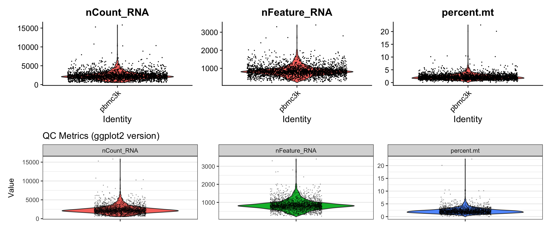
| Version | Author | Date |
|---|---|---|
| bf3d061 | crazyhottommy | 2025-11-02 |
What we learned:
- QC metrics are stored in
pbmc3k@meta.dataas columns - We extracted the data, reshaped it to long format with
pivot_longer() - Created violin plots with
geom_violin()and overlaid points withgeom_jitter() - Used
facet_wrap()to create separate panels
Visualization 2: QC Scatter Plots
Feature-feature relationships help identify potential issues (e.g., correlation between UMI count and gene count).
# SEURAT WRAPPER VERSION
p1 <- FeatureScatter(pbmc3k, feature1 = "nCount_RNA", feature2 = "nFeature_RNA") +
  labs(title = "Seurat wrapper")

# GGPLOT2 VERSION
# Again, we extract from metadata
scatter_data <- pbmc3k@meta.data %>%
  select(nCount_RNA, nFeature_RNA, percent.mt)

p2 <- ggplot(scatter_data, aes(x = nCount_RNA, y = nFeature_RNA)) +
  geom_point(alpha = 0.5, size = 0.5, color = "steelblue") +
  geom_smooth(method = "lm", color = "red", se = FALSE) +
  labs(title = "ggplot2 version",
       x = "Total UMI Counts",
       y = "Number of Genes Detected") +
  theme_bw()

# Display side by side
p1 + p2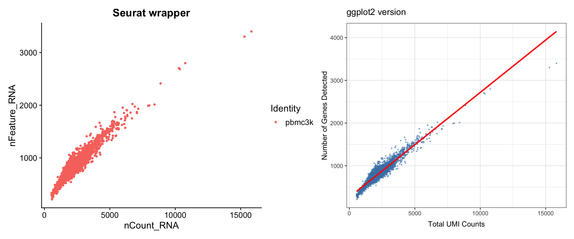
| Version | Author | Date |
|---|---|---|
| bf3d061 | crazyhottommy | 2025-11-02 |
What we learned:
- Simple scatter plots require data from
@meta.data - We can add trend lines with
geom_smooth() - The patchwork package (
+) makes side-by-side comparison easy
Filter, Normalize, and Find Variable Features
Now let’s continue with the standard Seurat workflow.
# Filter cells based on QC metrics
pbmc3k <- subset(pbmc3k, subset = nFeature_RNA > 200 & nFeature_RNA < 2500 & percent.mt < 5)

# Normalize the data
pbmc3k <- NormalizeData(pbmc3k)

# Find variable features
pbmc3k <- FindVariableFeatures(pbmc3k, selection.method = "vst", nfeatures = 2000)
Visualization 3: Variable Feature Plot
This plot shows the most variable genes, which drive heterogeneity in the dataset.
# SEURAT WRAPPER VERSION
p1 <- VariableFeaturePlot(pbmc3k) +
  labs(title = "Seurat wrapper")

# GGPLOT2 VERSION
# Key concept: Variable feature info is stored in pbmc3k@assays$RNA@meta.features
# or we can access it with HVFInfo()
hvf_data <- HVFInfo(pbmc3k) %>%
  mutate(gene = rownames(.),
         variable = gene %in% VariableFeatures(pbmc3k))

# Get top 10 variable genes to label
top10_genes <- head(VariableFeatures(pbmc3k), 10)

p2 <- ggplot(hvf_data, aes(x = mean, y = variance.standardized)) +
  geom_point(aes(color = variable), alpha = 0.5, size = 0.8) +
  scale_color_manual(values = c("grey70", "red"),
                     labels = c("Non-variable", "Variable")) +
  scale_x_log10() +
  geom_text(data = hvf_data %>% filter(gene %in% top10_genes),
            aes(label = gene), size = 3, nudge_y = 0.5) +
  labs(title = "ggplot2 version",
       x = "Average Expression",
       y = "Standardized Variance",
       color = "Feature Type") +
  theme_bw()

# Display side by side
p1 + p2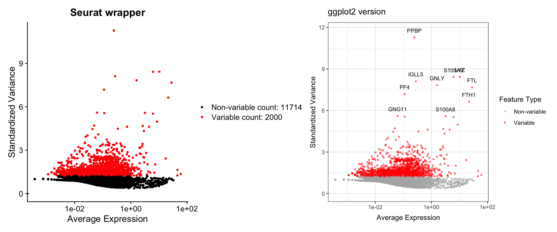
| Version | Author | Date |
|---|---|---|
| bf3d061 | crazyhottommy | 2025-11-02 |
What we learned:
- Variable feature information is accessed with
HVFInfo() - Top variable genes are retrieved with
VariableFeatures() - We can label specific genes with
geom_text() - Color coding highlights different gene sets
Scaling and PCA
# Scale the data
pbmc3k <- ScaleData(pbmc3k)

# Run PCA
pbmc3k <- RunPCA(pbmc3k, features = VariableFeatures(pbmc3k))
Visualization 4: Elbow Plot
The elbow plot helps determine how many PCs to use for downstream analysis.
# SEURAT WRAPPER VERSION
p1 <- ElbowPlot(pbmc3k, ndims = 30) +
  labs(title = "Seurat wrapper")

# GGPLOT2 VERSION
# Key concept: PCA results are stored in pbmc3k@reductions$pca
# Standard deviations are in pbmc3k@reductions$pca@stdev
pca_variance <- data.frame(
  PC = 1:30,
  stdev = pbmc3k@reductions$pca@stdev[1:30]
) %>%
  mutate(variance_explained = stdev^2)

p2 <- ggplot(pca_variance, aes(x = PC, y = stdev)) +
  geom_point(size = 2, color = "steelblue") +
  geom_line(color = "steelblue") +
  labs(title = "ggplot2 version",
       x = "Principal Component",
       y = "Standard Deviation") +
  theme_bw()

# Display side by side
p1 + p2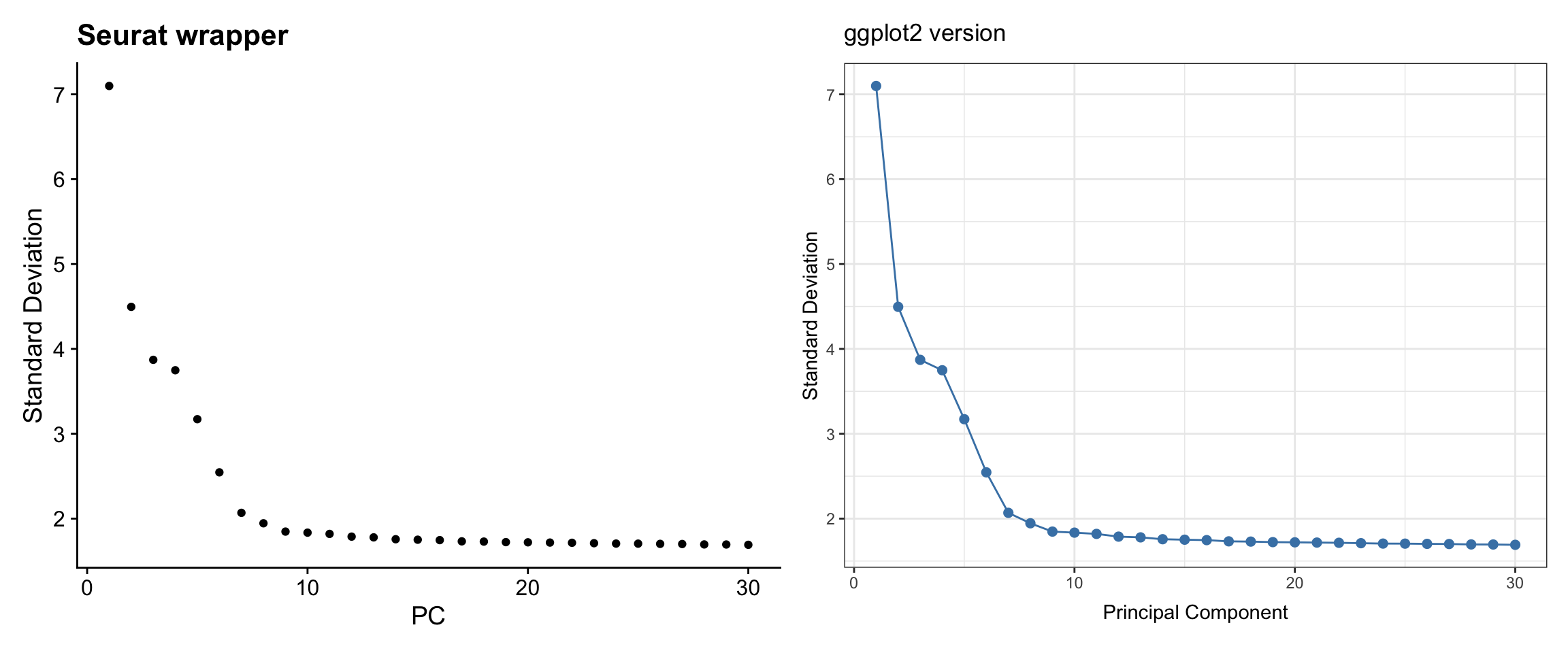
| Version | Author | Date |
|---|---|---|
| bf3d061 | crazyhottommy | 2025-11-02 |
What we learned:
- PCA results are stored in
pbmc3k@reductions$pca - Standard deviations are in the
@stdevslot - We extracted PC variance and plotted it with
geom_point()+geom_line()
Visualization 5: PCA Dim Plot
Visualize cells in PC space to see data structure.
# SEURAT WRAPPER VERSION
p1 <- DimPlot(pbmc3k, reduction = "pca", dims = c(1, 2)) +
  labs(title = "Seurat wrapper")

# GGPLOT2 VERSION
# Key concept: Cell embeddings are in pbmc3k@reductions$pca@cell.embeddings
pca_embeddings <- as.data.frame(pbmc3k@reductions$pca@cell.embeddings[, 1:2])
colnames(pca_embeddings) <- c("PC1", "PC2")

pca_embeddings<- cbind(pca_embeddings, pbmc3k@meta.data)

p2 <- ggplot(pca_embeddings, aes(x = PC1, y = PC2)) +
  geom_point(alpha = 0.5, size = 0.8, color = "red") +
  labs(title = "ggplot2 version",
       x = "PC 1", y = "PC 2") +
  theme_bw() +
  coord_fixed()  # Equal aspect ratio

# Display side by side
p1 + p2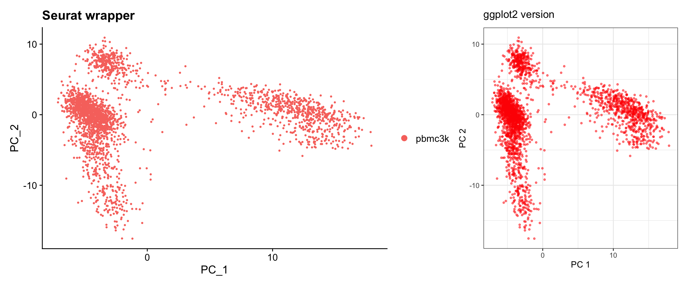
| Version | Author | Date |
|---|---|---|
| bf3d061 | crazyhottommy | 2025-11-02 |
ggplot(pca_embeddings, aes(x = PC1, y = PC2)) +
  geom_point(aes(color = seurat_annotations), alpha = 0.5, size = 0.8) +
  labs(title = "ggplot2 version",
       x = "PC 1", y = "PC 2") +
  theme_bw() +
coord_fixed() 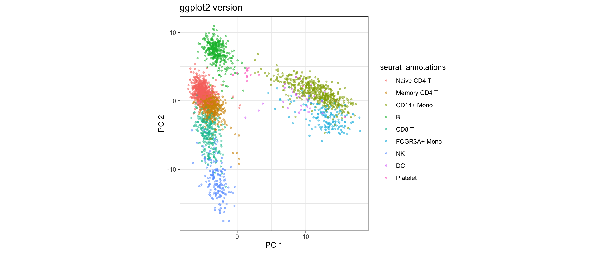
What we learned:
- Cell embeddings (coordinates in reduced dimensions) are in
@reductions$pca@cell.embeddings - Each row is a cell, each column is a PC
- We can easily switch which PCs to plot by selecting different columns
Clustering and UMAP
# Build nearest neighbor graph and cluster
pbmc3k <- FindNeighbors(pbmc3k, dims = 1:10)
pbmc3k <- FindClusters(pbmc3k, resolution = 0.5)
#> Modularity Optimizer version 1.3.0 by Ludo Waltman and Nees Jan van Eck
#>
#> Number of nodes: 2638
#> Number of edges: 95927
#>
#> Running Louvain algorithm...
#> Maximum modularity in 10 random starts: 0.8728
#> Number of communities: 9
#> Elapsed time: 0 seconds# Run UMAP
pbmc3k <- RunUMAP(pbmc3k, dims = 1:10)Visualization 6: UMAP with Clusters
This is one of the most common scRNA-seq visualizations.
# SEURAT WRAPPER VERSION
p1 <- DimPlot(pbmc3k, reduction = "umap", label = TRUE) +
  labs(title = "Seurat wrapper") +
  NoLegend()

# GGPLOT2 VERSION
# Key concept: UMAP coordinates are in @reductions$umap@cell.embeddings
# Cluster assignments are in @meta.data$seurat_clusters
umap_data <- as.data.frame(pbmc3k@reductions$umap@cell.embeddings)
colnames(umap_data) <- c("UMAP1", "UMAP2")
umap_data$cluster <- pbmc3k@meta.data$seurat_clusters

# Calculate cluster centroids for labels
cluster_centers <- umap_data %>%
  group_by(cluster) %>%
  summarize(UMAP1 = median(UMAP1),
            UMAP2 = median(UMAP2))

p2 <- ggplot(umap_data, aes(x = UMAP1, y = UMAP2, color = cluster)) +
  geom_point(alpha = 0.6, size = 0.8) +
  geom_text(data = cluster_centers, aes(label = cluster),
            size = 5, color = "black", fontface = "bold") +
  labs(title = "ggplot2 version") +
  theme_bw() +
  theme(legend.position = "none") +
  coord_fixed()

# Display side by side
p1 + p2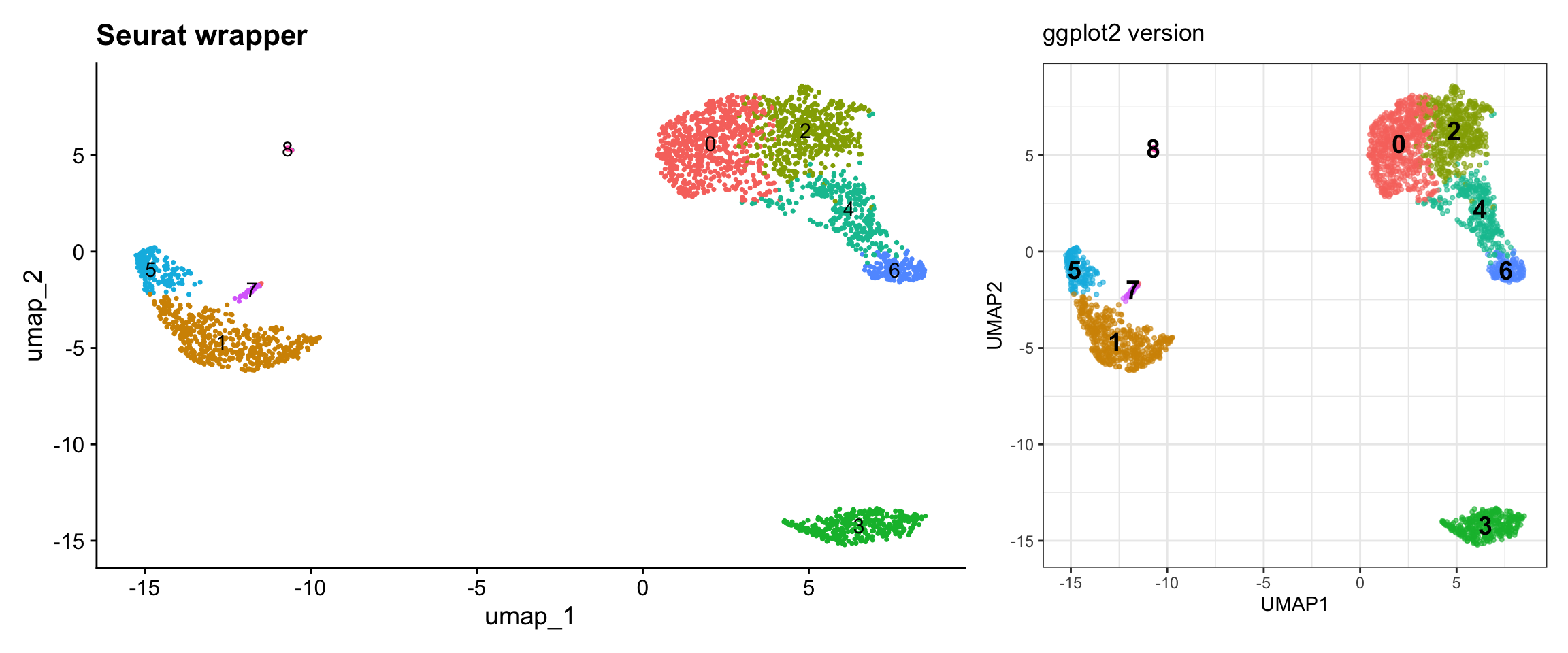
| Version | Author | Date |
|---|---|---|
| bf3d061 | crazyhottommy | 2025-11-02 |
What we learned:
- UMAP coordinates are in
@reductions$umap@cell.embeddings - Cluster assignments are in
@meta.data$seurat_clusters - We can combine data from different slots
- Calculated cluster centroids for label placement
Visualization 7: Feature Expression on UMAP
Show gene expression levels overlaid on UMAP.
# Let's look at some marker genes
genes <- c("CD3D", "CD14", "CD79A")

# SEURAT WRAPPER VERSION
p1 <- FeaturePlot(pbmc3k, features = genes, ncol = 1) +
  plot_annotation(title = "Seurat wrapper")

# GGPLOT2 VERSION
# Key concept: Expression data is in the assay, accessed with GetAssayData() or FetchData()
# FetchData() is convenient - it can pull from multiple sources at once

# Get UMAP coordinates and expression values
feature_data <- FetchData(pbmc3k, vars = c("umap_1", "umap_2", genes))

# Reshape for faceting
feature_long <- feature_data %>%
  pivot_longer(cols = all_of(genes),
               names_to = "gene",
               values_to = "expression") %>%
  # change the levels according to the order we specified
  mutate(gene = factor(gene, levels = genes))

p2 <- ggplot(feature_long, aes(x = umap_1, y = umap_2, color = expression)) +
  geom_point(alpha = 0.6, size = 0.5) +
  facet_wrap(~ gene, ncol = 1) +
  scale_color_gradientn(colors = c("lightgrey", "blue", "red", "darkred")) +
  labs(title = "ggplot2 version", color = "Expression") +
  theme_bw() +
  coord_fixed()

# Display side by side
p1 | p2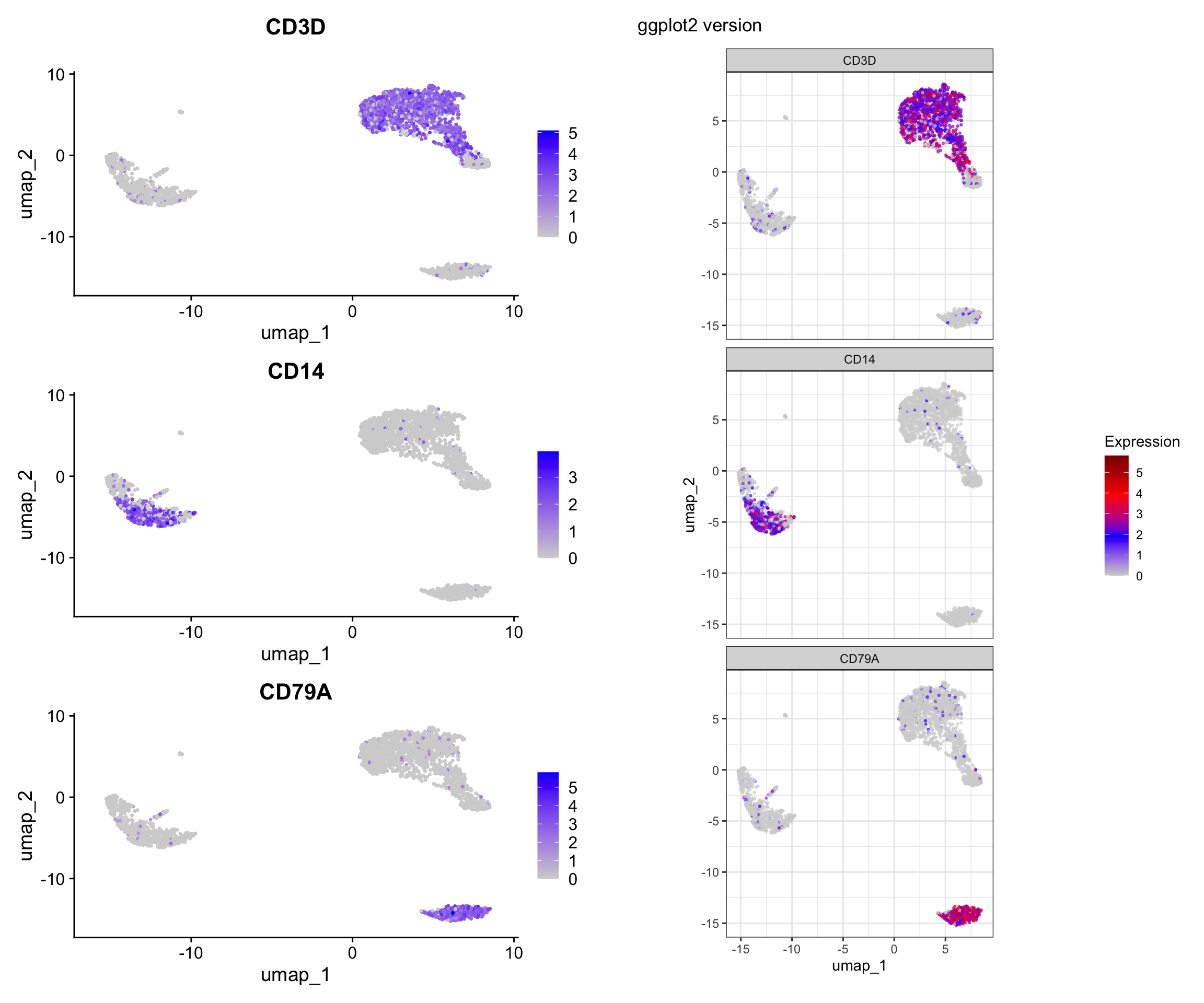
| Version | Author | Date |
|---|---|---|
| bf3d061 | crazyhottommy | 2025-11-02 |
What we learned:
FetchData()is a powerful function that can retrieve:- Dimensional reduction coordinates (UMAP_1, UMAP_2, PC_1, etc.)
- Gene expression values
- Metadata columns
- All in one convenient dataframe!
- We reshaped the data to long format for faceting
- Custom color scales with
scale_color_gradientn()
Visualization 8: Split Visualization by Metadata
Sometimes you want to split visualizations by a metadata variable. Let’s add a mock “treatment” variable to demonstrate.
# Add a mock treatment variable (just for demonstration)
set.seed(42)
pbmc3k$treatment <- sample(c("Control", "Treated"), ncol(pbmc3k), replace = TRUE)

# SEURAT WRAPPER VERSION
p1 <- DimPlot(pbmc3k, reduction = "umap", split.by = "treatment") +
  plot_annotation(title = "Seurat wrapper")

# GGPLOT2 VERSION
# Extract UMAP coordinates, clusters, and metadata
umap_split <- as.data.frame(pbmc3k@reductions$umap@cell.embeddings)
colnames(umap_split) <- c("UMAP1", "UMAP2")
umap_split$cluster <- pbmc3k@meta.data$seurat_clusters
umap_split$treatment <- pbmc3k@meta.data$treatment

p2 <- ggplot(umap_split, aes(x = UMAP1, y = UMAP2, color = cluster)) +
  geom_point(alpha = 0.6, size = 0.5) +
  facet_wrap(~ treatment) +
  labs(title = "ggplot2 version") +
  theme_bw() +
  coord_fixed()

# Display
p1 / p2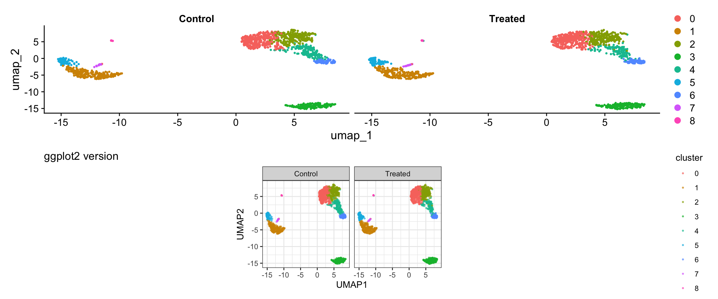
| Version | Author | Date |
|---|---|---|
| bf3d061 | crazyhottommy | 2025-11-02 |
What we learned:
- Can combine multiple metadata columns with embedding coordinates
facet_wrap()enables splitting by any variable- Full control over layout and appearance
Finding Marker Genes
# Find markers for cluster 0
cluster0_markers <- FindMarkers(pbmc3k, ident.1 = 0, min.pct = 0.25)

# Find all markers
pbmc_markers <- FindAllMarkers(pbmc3k, only.pos = TRUE, min.pct = 0.25, logfc.threshold = 0.25)

# Get top 5 markers per cluster
top5_markers <- pbmc_markers %>%
  group_by(cluster) %>%
  top_n(n = 5, wt = avg_log2FC)

head(top5_markers, 15)
#> # A tibble: 15 × 7
#> # Groups: cluster [3]
#> p_val avg_log2FC pct.1 pct.2 p_val_adj cluster gene
#> <dbl> <dbl> <dbl> <dbl> <dbl> <fct> <chr>
#> 1 9.57e- 88 2.40 0.447 0.108 1.31e- 83 0 CCR7
#> 2 1.35e- 51 2.14 0.342 0.103 1.86e- 47 0 LEF1
#> 3 2.81e- 44 1.53 0.443 0.185 3.85e- 40 0 PIK3IP1
#> 4 6.27e- 43 1.99 0.33 0.112 8.60e- 39 0 PRKCQ-AS1
#> 5 1.34e- 34 1.96 0.268 0.087 1.84e- 30 0 MAL
#> 6 0 6.65 0.975 0.121 0 1 S100A8
#> 7 0 6.18 0.996 0.215 0 1 S100A9
#> 8 1.03e-295 5.98 0.667 0.027 1.42e-291 1 CD14
#> 9 7.07e-139 7.28 0.299 0.004 9.70e-135 1 FOLR3
#> 10 3.38e-121 6.74 0.277 0.006 4.64e-117 1 S100A12
#> 11 3.44e- 59 1.63 0.651 0.245 4.71e- 55 2 CD2
#> 12 2.97e- 58 2.09 0.42 0.111 4.07e- 54 2 AQP3
#> 13 2.92e- 42 1.52 0.397 0.124 4.00e- 38 2 TRAT1
#> 14 5.03e- 34 1.87 0.263 0.07 6.90e- 30 2 CD40LG
#> 15 2.65e- 20 1.60 0.305 0.136 3.63e- 16 2 CORO1BVisualization 9: Violin Plot by Cluster
Show expression of marker genes across clusters.
# Select a few top marker genes
selected_genes <- c("IL7R", "CCR7", "CD14", "LYZ", "MS4A1", "CD8A")

# SEURAT WRAPPER VERSION
p1 <- VlnPlot(pbmc3k, features = selected_genes, ncol = 2, pt.size = 0.1) +
  plot_annotation(title = "Seurat wrapper")

# GGPLOT2 VERSION
# Use FetchData to get cluster assignments and gene expression
violin_data <- FetchData(pbmc3k, vars = c("seurat_clusters", selected_genes))

# Reshape to long format
violin_long <- violin_data %>%
  pivot_longer(cols = all_of(selected_genes),
               names_to = "gene",
               values_to = "expression") %>%
  mutate(gene = factor(gene, levels = selected_genes))

p2 <- ggplot(violin_long, aes(x = seurat_clusters, y = expression, fill = seurat_clusters)) +
  geom_violin(scale = "width", trim = TRUE) +
  facet_wrap(~ gene, scales = "free_y", ncol = 2) +
  labs(title = "ggplot2 version",
       x = "Cluster", y = "Expression Level") +
  theme_bw() +
  theme(legend.position = "none")

# Display
print(p1)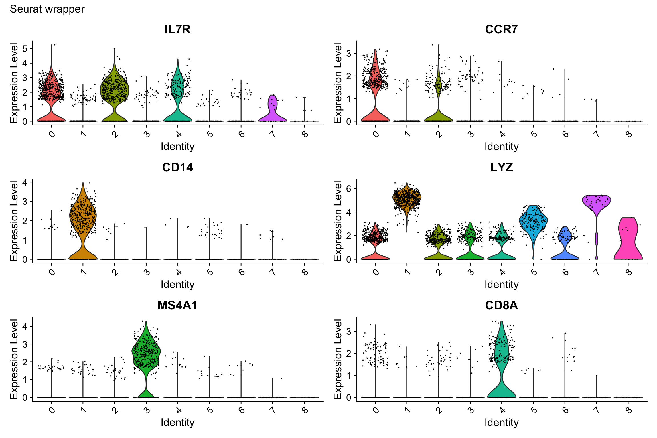
| Version | Author | Date |
|---|---|---|
| bf3d061 | crazyhottommy | 2025-11-02 |
print(p2)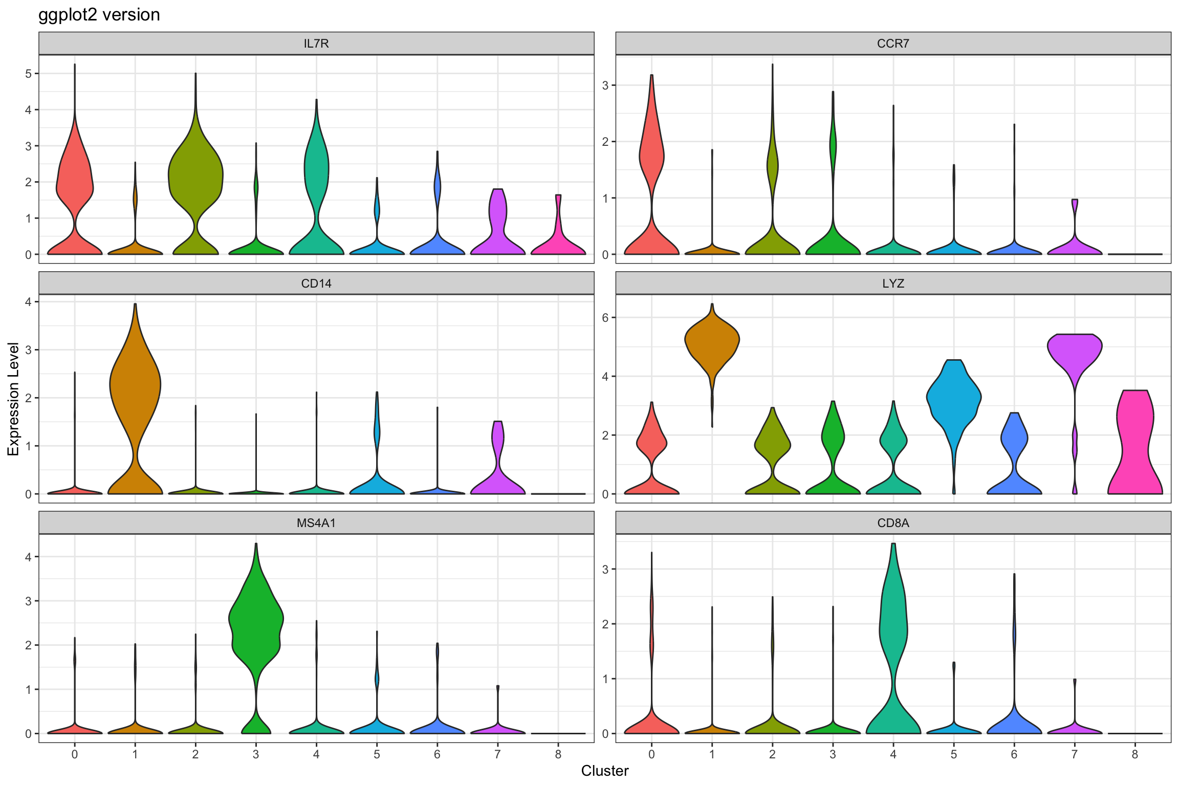
| Version | Author | Date |
|---|---|---|
| bf3d061 | crazyhottommy | 2025-11-02 |
Note if you see inconsistence of the ggplot2 version vs the Seurat version, see this github issue. Seurat adds random noise before plotting the violin plot.
What we learned:
- Combined cluster identity with gene expression using
FetchData() - Used
pivot_longer()to reshape for faceting scales = "free_y"allows different y-axis scales per facet (useful when genes have different expression ranges)
Visualization 10: Marker Gene Heatmap
Heatmaps show expression patterns of marker genes across clusters.
# Get top 3 markers per cluster for a cleaner visualization
top3_markers <- pbmc_markers %>%
  group_by(cluster) %>%
  top_n(n = 3, wt = avg_log2FC)

# SEURAT WRAPPER VERSION
p1 <- DoHeatmap(pbmc3k, features = top3_markers$gene, size = 3, angle = 90) +
  labs(title = "Seurat wrapper") +
  theme(axis.text.y = element_text(size = 8))

# GGPLOT2 VERSION
# Key concept: We need the scaled expression matrix
# Get scaled data for the marker genes
scaled_expr <- GetAssayData(pbmc3k, layer = "scale.data")
markers_to_plot <- top3_markers$gene[top3_markers$gene %in% rownames(scaled_expr)]

# Extract scaled expression for these genes
heatmap_data <- as.data.frame(t(as.matrix(scaled_expr[markers_to_plot, ])))
heatmap_data$cluster <- pbmc3k@meta.data$seurat_clusters
heatmap_data$cell <- rownames(heatmap_data)

# Order cells by cluster
heatmap_data <- heatmap_data %>%
  arrange(cluster)

# Reshape to long format
heatmap_long <- heatmap_data %>%
  pivot_longer(cols = all_of(markers_to_plot),
               names_to = "gene",
               values_to = "expression")

# Create ordered factors for proper display
heatmap_long$cell <- factor(heatmap_long$cell, levels = unique(heatmap_data$cell))
heatmap_long$gene <- factor(heatmap_long$gene, levels = rev(top3_markers$gene))

p2 <- ggplot(heatmap_long, aes(x = cell, y = gene, fill = expression)) +
  geom_tile() +
  scale_fill_gradient2(low = "blue", mid = "white", high = "red",
                       midpoint = 0, limits = c(-2, 2)) +
  labs(title = "ggplot2 version", x = "Cells", y = "Genes", fill = "Scaled\nExpression") +
  theme_minimal() +
  theme(axis.text.x = element_blank(),
        axis.ticks.x = element_blank(),
        axis.text.y = element_text(size = 8),
        panel.grid = element_blank())

# Display
print(p1)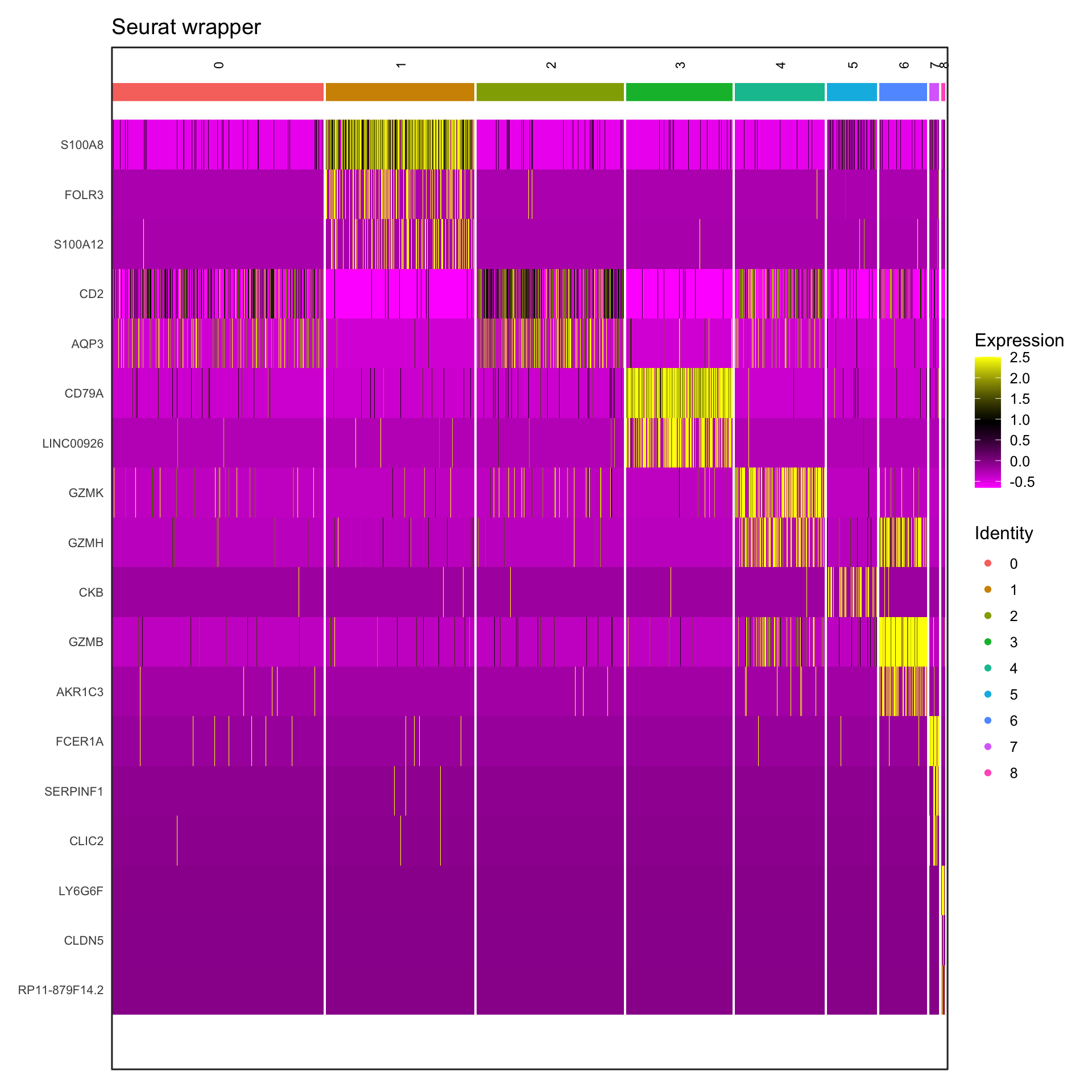
| Version | Author | Date |
|---|---|---|
| bf3d061 | crazyhottommy | 2025-11-02 |
print(p2)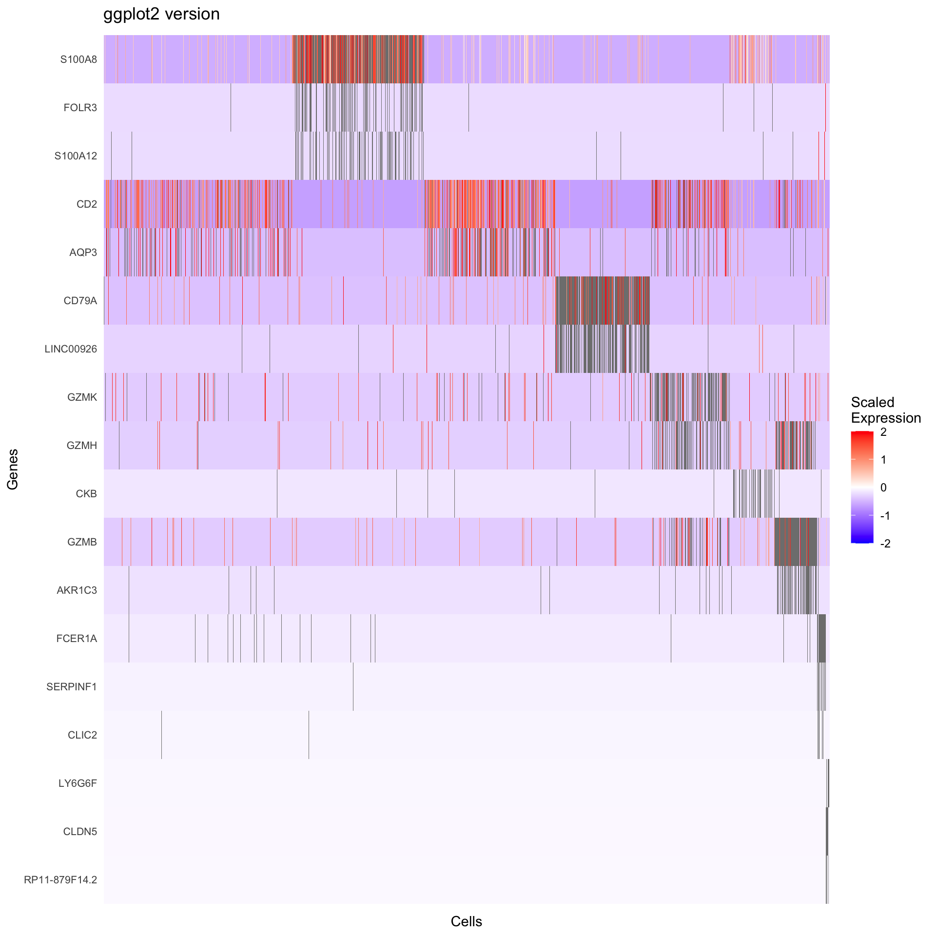
| Version | Author | Date |
|---|---|---|
| bf3d061 | crazyhottommy | 2025-11-02 |
What we learned:
- Scaled expression data is in
GetAssayData(object, slot = "scale.data") - Genes are rows, cells are columns in the expression matrix
- We transposed and reshaped the data for ggplot2
geom_tile()creates heatmapsscale_fill_gradient2()creates a diverging color scale
Visualization 11: Dot Plot
Dot plots efficiently show both expression level (color) and percentage of cells expressing (size) a gene.
# Select genes to visualize
selected_genes <- c("IL7R", "CCR7", "CD14", "LYZ", "S100A4", "MS4A1",
                    "CD8A", "FCGR3A", "MS4A7", "GNLY", "NKG7")

# SEURAT WRAPPER VERSION
p1 <- DotPlot(pbmc3k, features = selected_genes) +
  labs(title = "Seurat wrapper") +
  theme(axis.text.x = element_text(angle = 45, hjust = 1))

# GGPLOT2 VERSION
# We need to calculate:
# 1. Average expression per cluster
# 2. Percentage of cells expressing per cluster

# Get expression data and cluster assignments
dotplot_data <- FetchData(pbmc3k, vars = c("seurat_clusters", selected_genes))

# Calculate summary statistics
dotplot_summary <- dotplot_data %>%
  pivot_longer(cols = all_of(selected_genes),
               names_to = "gene",
               values_to = "expression") %>%
  group_by(seurat_clusters, gene) %>%
  summarize(
    avg_expression = mean(expression),
    pct_expressed = sum(expression > 0) / n() * 100,
    .groups = "drop"
  ) %>%
  mutate(gene = factor(gene, levels = selected_genes))

p2 <- ggplot(dotplot_summary, aes(x = gene, y = seurat_clusters)) +
  geom_point(aes(size = pct_expressed, color = avg_expression)) +
  scale_color_gradient(low = "lightgrey", high = "red") +
  scale_size_continuous(range = c(0, 6)) +
  labs(title = "ggplot2 version",
       x = "Gene", y = "Cluster",
       color = "Average\nExpression",
       size = "% Expressed") +
  theme_bw() +
  theme(axis.text.x = element_text(angle = 45, hjust = 1))

# Display
p1 / p2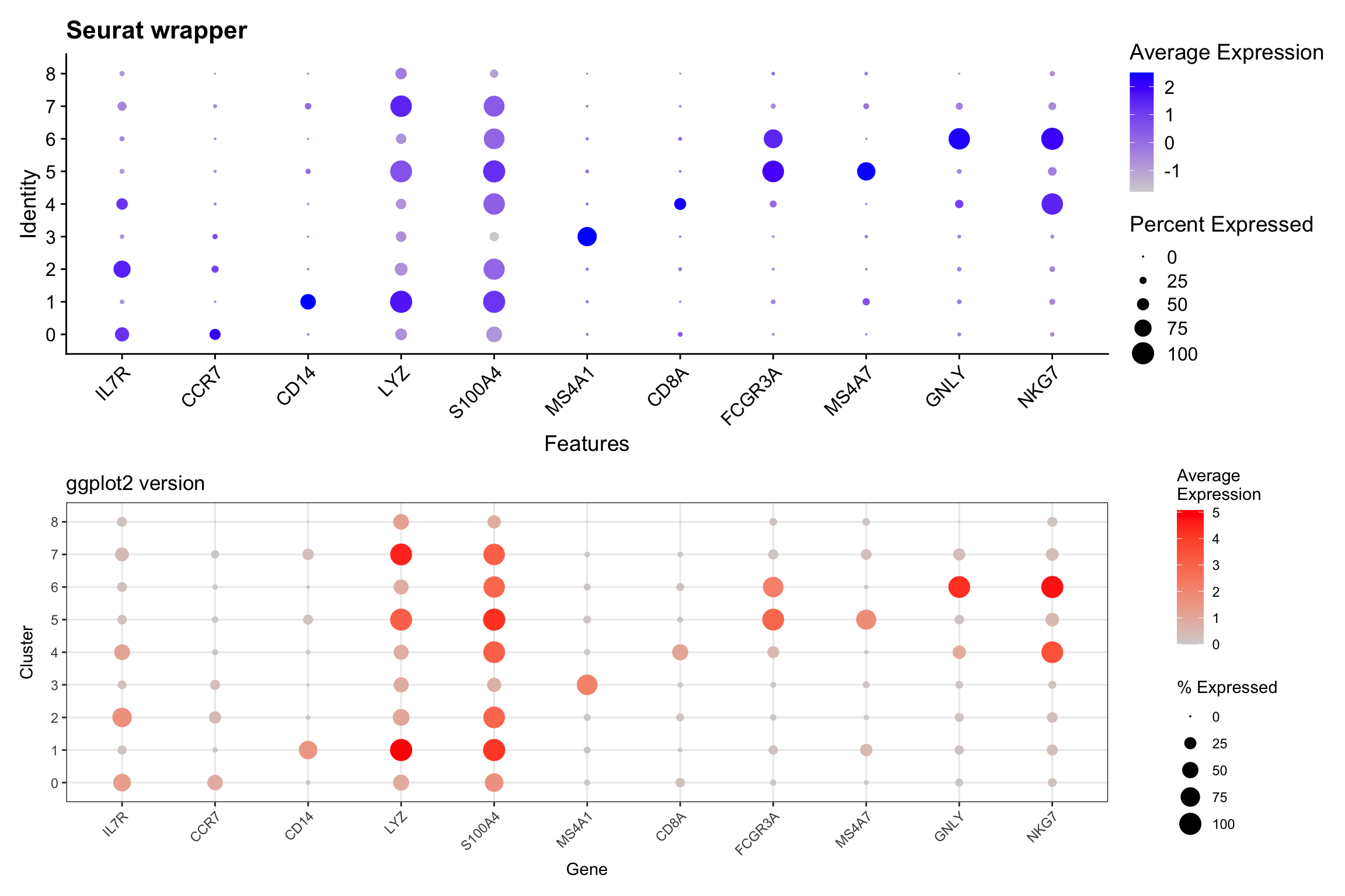
| Version | Author | Date |
|---|---|---|
| bf3d061 | crazyhottommy | 2025-11-02 |
What we learned:
- Dot plots require calculating summary statistics per group
- Used
group_by()andsummarize()to compute averages and percentages - Mapped two variables to aesthetics:
sizeandcolor - This demonstrates how ggplot2 gives you control over the calculation
Bonus
ggplot2 is great but lacks native clustering implementation. Instead,
we can use Complexheatmap for the same visualization task
but adding the clustering on the fly.
read my blog posts:
You may also take a look at the R package scCustomize which implements those functions.
Assign Cell Type Identity
Visualization 12: UMAP with Cell Type Labels
# SEURAT WRAPPER VERSION
p1 <- DimPlot(pbmc3k, reduction = "umap", group.by = "seurat_annotations", label = TRUE, repel = TRUE) +
  labs(title = "Seurat wrapper") +
  NoLegend()

# GGPLOT2 VERSION
umap_celltype <- as.data.frame(pbmc3k@reductions$umap@cell.embeddings)
colnames(umap_celltype) <- c("UMAP1", "UMAP2")
umap_celltype$celltype <- pbmc3k$seurat_annotations

# Calculate centroids for labels
celltype_centers <- umap_celltype %>%
  group_by(celltype) %>%
  summarize(UMAP1 = median(UMAP1),
            UMAP2 = median(UMAP2))

p2 <- ggplot(umap_celltype, aes(x = UMAP1, y = UMAP2, color = celltype)) +
  geom_point(alpha = 0.6, size = 0.8) +
  geom_text(data = celltype_centers, aes(label = celltype),
            size = 3, color = "black", fontface = "bold",
            check_overlap = TRUE) +
  labs(title = "ggplot2 version") +
  theme_bw() +
  theme(legend.position = "right") +
  coord_fixed() +
  NoLegend()

# Display
p1 + p2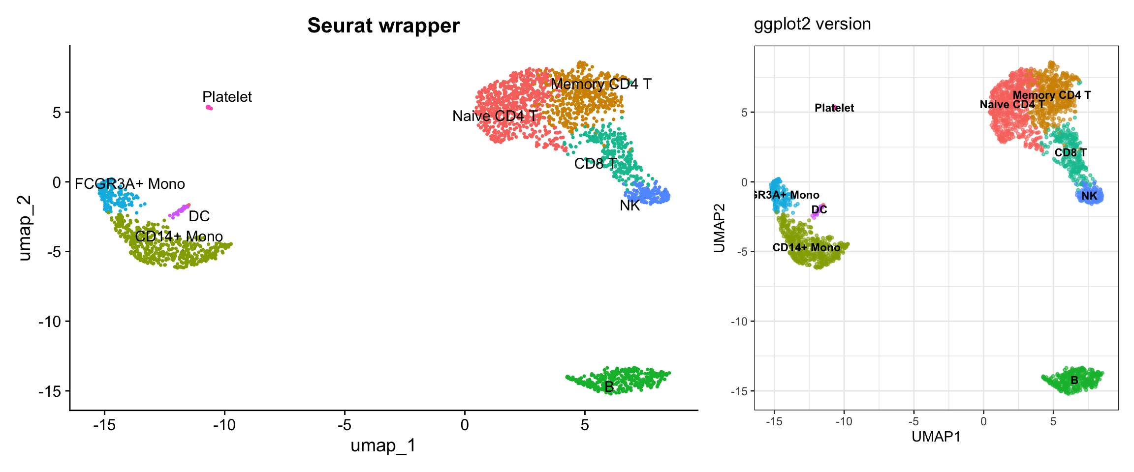
| Version | Author | Date |
|---|---|---|
| bf3d061 | crazyhottommy | 2025-11-02 |
What we learned:
- Cell type annotations are just another metadata column
- We accessed it the same way as cluster assignments
- Full control over colors, label placement, and legend
Summary: Key Takeaways
Data Access Cheat Sheet
| Data Type | Location | Access Method |
|---|---|---|
| Metadata (QC metrics, clusters, etc.) | object@meta.data |
Direct access or FetchData() |
| Raw counts | object@assays$RNA@counts |
GetAssayData(slot = "counts") |
| Normalized expression | object@assays$RNA@data |
GetAssayData(slot = "data") |
| Scaled expression | object@assays$RNA@scale.data |
GetAssayData(slot = "scale.data") |
| PCA embeddings | object@reductions$pca@cell.embeddings |
Direct access or FetchData("PC_1", "PC_2", ...) |
| UMAP embeddings | object@reductions$umap@cell.embeddings |
Direct access or FetchData("UMAP_1", "UMAP_2") |
| Variable features | Internal | VariableFeatures() or HVFInfo() |
| Combined data | Multiple sources | FetchData() - most convenient! |
When to Use Seurat Wrappers vs ggplot2
Use Seurat wrappers when:
- You need a quick exploratory visualization
- The default styling meets your needs
- You’re in the early stages of analysis
Use ggplot2 when:
- You need publication-quality figures with specific styling
- You want to combine data from multiple sources
- You need custom calculations or transformations
- You want to create novel visualizations not provided by Seurat
- You need fine-grained control over every aspect of the plot
Final Thoughts
The power of understanding how to extract data from Seurat objects means you’re not limited to the visualizations provided by the package. You can:
- Create entirely new plot types
- Combine multiple data types in creative ways
- Apply advanced statistical visualizations
- Match journal or institutional style guidelines exactly
- Integrate with other R packages and workflows
Practice exercise: Try recreating other Seurat plots we didn’t cover, such as:
RidgePlot()- Ridge plots for gene expressionVizDimLoadings()- Top genes in PC loadings- Custom multi-panel figures combining different data types
The key is always the same: understand where the data lives, extract it to a tidy dataframe, and use ggplot2 to visualize it!
Session Info
sessionInfo()#> R version 4.4.1 (2024-06-14)
#> Platform: aarch64-apple-darwin20
#> Running under: macOS Sonoma 14.1
#>
#> Matrix products: default
#> BLAS: /Library/Frameworks/R.framework/Versions/4.4-arm64/Resources/lib/libRblas.0.dylib
#> LAPACK: /Library/Frameworks/R.framework/Versions/4.4-arm64/Resources/lib/libRlapack.dylib; LAPACK version 3.12.0
#>
#> locale:
#> [1] en_US.UTF-8/en_US.UTF-8/en_US.UTF-8/C/en_US.UTF-8/en_US.UTF-8
#>
#> time zone: America/New_York
#> tzcode source: internal
#>
#> attached base packages:
#> [1] stats graphics grDevices utils datasets methods base
#>
#> other attached packages:
#> [1] patchwork_1.2.0 tidyr_1.3.1 dplyr_1.1.4
#> [4] ggplot2_3.5.1 pbmc3k.SeuratData_3.1.4 SeuratData_0.2.2.9001
#> [7] Seurat_5.1.0 SeuratObject_5.0.2 sp_2.1-4
#> [10] workflowr_1.7.1
#>
#> loaded via a namespace (and not attached):
#> [1] RColorBrewer_1.1-3 rstudioapi_0.16.0 jsonlite_1.8.8
#> [4] magrittr_2.0.3 ggbeeswarm_0.7.2 spatstat.utils_3.1-0
#> [7] farver_2.1.2 rmarkdown_2.27 fs_1.6.4
#> [10] vctrs_0.6.5 ROCR_1.0-11 spatstat.explore_3.3-2
#> [13] htmltools_0.5.8.1 sass_0.4.9 sctransform_0.4.1
#> [16] parallelly_1.38.0 KernSmooth_2.23-24 bslib_0.8.0
#> [19] htmlwidgets_1.6.4 ica_1.0-3 plyr_1.8.9
#> [22] plotly_4.10.4 zoo_1.8-12 cachem_1.1.0
#> [25] whisker_0.4.1 igraph_2.0.3 mime_0.12
#> [28] lifecycle_1.0.4 pkgconfig_2.0.3 Matrix_1.7-0
#> [31] R6_2.5.1 fastmap_1.2.0 fitdistrplus_1.2-1
#> [34] future_1.34.0 shiny_1.9.0 digest_0.6.36
#> [37] colorspace_2.1-1 ps_1.7.7 rprojroot_2.0.4
#> [40] tensor_1.5 RSpectra_0.16-2 irlba_2.3.5.1
#> [43] labeling_0.4.3 progressr_0.14.0 fansi_1.0.6
#> [46] spatstat.sparse_3.1-0 mgcv_1.9-1 httr_1.4.7
#> [49] polyclip_1.10-7 abind_1.4-5 compiler_4.4.1
#> [52] withr_3.0.0 fastDummies_1.7.4 highr_0.11
#> [55] MASS_7.3-60.2 rappdirs_0.3.3 tools_4.4.1
#> [58] vipor_0.4.7 lmtest_0.9-40 beeswarm_0.4.0
#> [61] httpuv_1.6.15 future.apply_1.11.2 goftest_1.2-3
#> [64] glue_1.8.0 callr_3.7.6 nlme_3.1-164
#> [67] promises_1.3.0 grid_4.4.1 Rtsne_0.17
#> [70] getPass_0.2-4 cluster_2.1.6 reshape2_1.4.4
#> [73] generics_0.1.3 gtable_0.3.5 spatstat.data_3.1-2
#> [76] data.table_1.15.4 utf8_1.2.4 spatstat.geom_3.3-2
#> [79] RcppAnnoy_0.0.22 ggrepel_0.9.5 RANN_2.6.1
#> [82] pillar_1.9.0 stringr_1.5.1 limma_3.60.4
#> [85] spam_2.10-0 RcppHNSW_0.6.0 later_1.3.2
#> [88] splines_4.4.1 lattice_0.22-6 survival_3.6-4
#> [91] deldir_2.0-4 tidyselect_1.2.1 miniUI_0.1.1.1
#> [94] pbapply_1.7-2 knitr_1.48 git2r_0.35.0
#> [97] gridExtra_2.3 scattermore_1.2 xfun_0.52
#> [100] statmod_1.5.0 matrixStats_1.3.0 stringi_1.8.4
#> [103] lazyeval_0.2.2 yaml_2.3.10 evaluate_0.24.0
#> [106] codetools_0.2-20 tibble_3.2.1 cli_3.6.3
#> [109] uwot_0.2.2 xtable_1.8-4 reticulate_1.38.0
#> [112] munsell_0.5.1 processx_3.8.4 jquerylib_0.1.4
#> [115] Rcpp_1.0.13 globals_0.16.3 spatstat.random_3.3-1
#> [118] png_0.1-8 ggrastr_1.0.2 spatstat.univar_3.0-0
#> [121] parallel_4.4.1 presto_1.0.0 dotCall64_1.1-1
#> [124] listenv_0.9.1 viridisLite_0.4.2 scales_1.3.0
#> [127] ggridges_0.5.6 crayon_1.5.3 leiden_0.4.3.1
#> [130] purrr_1.0.2 rlang_1.1.4 cowplot_1.1.3