ggplot(res_df, aes(pvalue)) +
  geom_histogram(boundary = 0, bins = 30, fill = "#6b4de6", color = "white") +
  labs(title = "p-value distribution", x = "raw p-value", y = "genes") +
  theme_bw()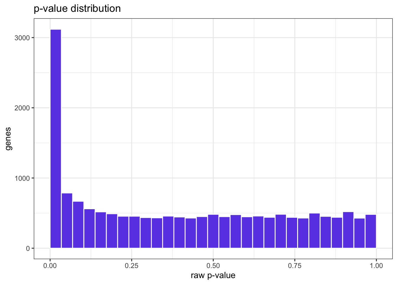
Numbers in a table are hard to trust until you see them. These are the plots every RNAseq analysis should produce — each one a different question you can ask Claude Code to answer.
Try this prompt
Plot a histogram of the raw p-values from the DESeq2 results and tell me whether the shape looks healthy.
ggplot(res_df, aes(pvalue)) +
geom_histogram(boundary = 0, bins = 30, fill = "#6b4de6", color = "white") +
labs(title = "p-value distribution", x = "raw p-value", y = "genes") +
theme_bw()
A healthy histogram is flat with a spike near zero: a uniform background of non-DE genes plus an enrichment of true positives. A U-shape or hill in the middle would warn of model problems.
Try this prompt
Apply a variance-stabilizing transformation and make a PCA plot colored by condition, labeling each sample.
vsd <- vst(dds, blind = TRUE)
pca <- plotPCA(vsd, intgroup = "condition", returnData = TRUE)
pv  <- round(100 * attr(pca, "percentVar"))

ggplot(pca, aes(PC1, PC2, color = condition, label = name)) +
  geom_point(size = 4) +
  ggrepel::geom_text_repel(size = 3, show.legend = FALSE) +
  labs(x = paste0("PC1: ", pv[1], "%"), y = paste0("PC2: ", pv[2], "%"),
       title = "PCA (variance-stabilized)") +
  theme_bw()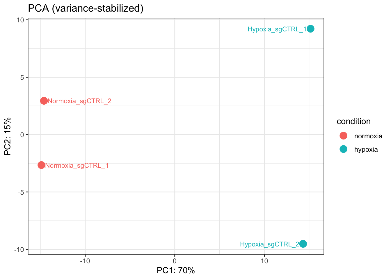
You want the two conditions to land in different parts of PC1 — evidence that the biggest source of variation is the treatment.
Try this prompt
Make an MA plot of the results so I can see fold change against mean expression.
plotMA(res, ylim = c(-6, 6), main = "MA: hypoxia vs normoxia")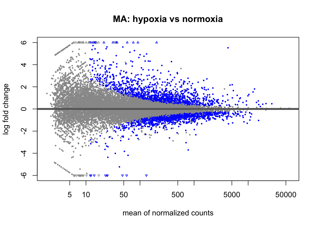
Each dot is a gene; blue dots are significant. Significant genes should spread away from the y = 0 line, and there should be no strong trend across the x-axis after normalization.
Try this prompt
Draw a volcano plot, highlight genes with padj < 0.05 and |log2FC| > 1, and label the top hypoxia genes.
volc <- res_df |>
  mutate(sig = !is.na(padj) & padj < 0.05 & abs(log2FoldChange) > 1)

labels <- volc |>
  filter(sig, gene_name %in% c("VEGFA","CA9","BNIP3","SLC2A1","PGK1","LDHA"))

ggplot(volc, aes(log2FoldChange, -log10(pvalue))) +
  geom_point(aes(color = sig), alpha = 0.5, size = 1) +
  scale_color_manual(values = c(`FALSE`="grey75", `TRUE`="#c0392b"), guide = "none") +
  ggrepel::geom_text_repel(data = labels, aes(label = gene_name), size = 3) +
  labs(title = "Volcano: hypoxia vs normoxia",
       x = "log2 fold change", y = "-log10 p-value") +
  theme_bw()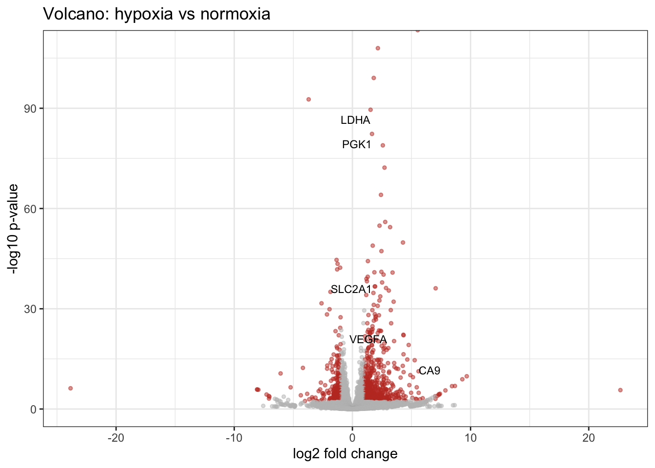
Try this prompt
Make a heatmap of the top 30 significant genes using the variance-stabilized counts, z-scored per gene, with samples annotated by condition.
library(pheatmap)

sig <- res_df |> filter(!is.na(padj) & padj < 0.05)
top_ids <- head(sig$gene_id, 30)
mat <- assay(vsd)[top_ids, , drop = FALSE]
rownames(mat) <- sig$gene_name[match(top_ids, sig$gene_id)]

ann <- data.frame(condition = colData(dds)$condition,
                  row.names = colnames(dds))

pheatmap(mat, scale = "row", annotation_col = ann,
         show_rownames = TRUE, fontsize_row = 8,
         main = "Top 30 DE genes (row z-score)")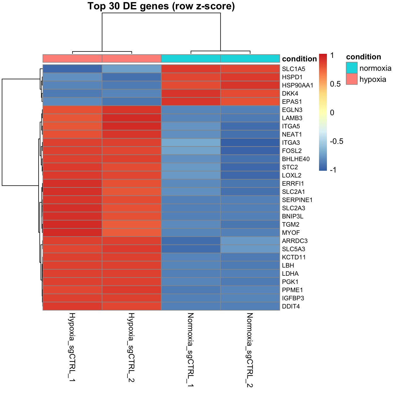
Clear blocks — hypoxia samples high where normoxia samples are low — are exactly what you hope to see.
→ What do these genes do? 5 · Enrichment.